C.R.A.P. Design Principle
C.R.A.P. is a design principle that helps create effective designs. Developed by Robin Patricia Williams, it stands for Contrast, Repetition, Alignment, and Proximity. Using C.R.A.P. can improve designs for any visual deliverable, including data visualizations, websites, landing pages, splash screens, user interfaces, eBooks, banner ads, and more.
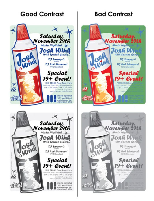
CONTRAST:
Contrast is an important design principle that helps to draw a viewer’s attention to specific elements. It can be created using different colors, element types, shapes, and sizes. Contrast is achieved by making distinct elements stand out in comparison to their surroundings. While black and white can be used to create contrast, there are many other options available for achieving this effect.
REPITITION:
Repetition is a design principle that helps to maintain consistency and create a cohesive visual experience. It can be achieved through the repetition of elements such as colors, shapes, textures, and sizes. Repetition helps users become familiar with the way information is presented and can aid in quick scanning and reading. In addition, repetition helps to establish an identity for a design. For example, the use of repetition in bullet lists with circular dots aids in the organization and presentation of information.
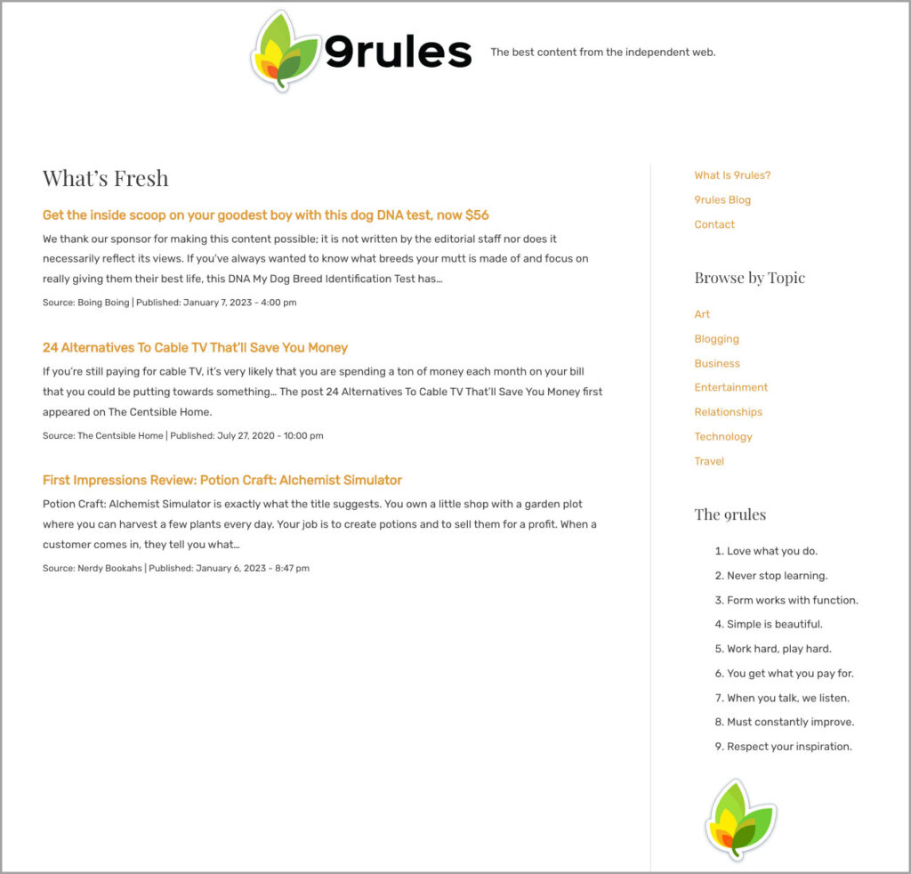
(Source: https://9rules.com/)
ALIGNMENT:
Alignment is a design principle that refers to the arrangement of elements within a design. It is used to create order and organization in a design. Alignment ensures that no element is positioned arbitrarily, and instead, each element is visually connected to the others forming relationships among elements, contributing to a cohesive overall design. There are two main types of alignment: edge alignment (right, left, top, and bottom) and center alignment. Alignment helps to create a sense of organization, balance and unity within a design.

(Source: https://vwo.com/blog/crap-design-principles/)
PROXIMITY:
The principle of proximity dictates that elements that are related or associated with each other should be placed close together (or “in close proximity”) in a design. This helps to create a clear hierarchy and organization within the design. In web and app design, the use of proximity can improve the user experience by making it easier for viewers to understand the relationships between different elements (i.e. which text is associated with which images). Conversely, placing unrelated elements too close together or spreading all elements evenly throughout a design can lead to confusion and a poor user experience.

(Source: https://vwo.com/blog/crap-design-principles/)
« Back to Glossary Index